In the world of design, there is a language that goes beyond words—a visual language that speaks directly to our senses and emotions. This language is shaped by the fundamental principles of graphic design, which serve as the building blocks for creating stunning and impactful visuals.
Adhering strictly to one-dimensional rules, such as “make it look good,” may not always yield optimal results. Instead, companies seeking to craft effective designs should consider how visual elements interact with their brand’s personality. Sometimes, breaking the rules can lead to more positive outcomes.
In this post, we invite you to join us on a journey of exploration as we dive deep into the 12 fundamental graphic design principles that make your creations stand out like a purple giraffe in a sea of black and white zebras.
Balance: Striking the Perfect Symmetry, or Not
Symmetry, with its inherent sense of orderliness and stability, can be a powerful tool in a designer’s repertoire. It evokes a sense of familiarity and balance. On the other hand, embracing asymmetry allows designers to infuse uniqueness and character into their creations. By combining both approaches, designers can craft designs that are not only visually striking but also memorable and distinctive to viewers.
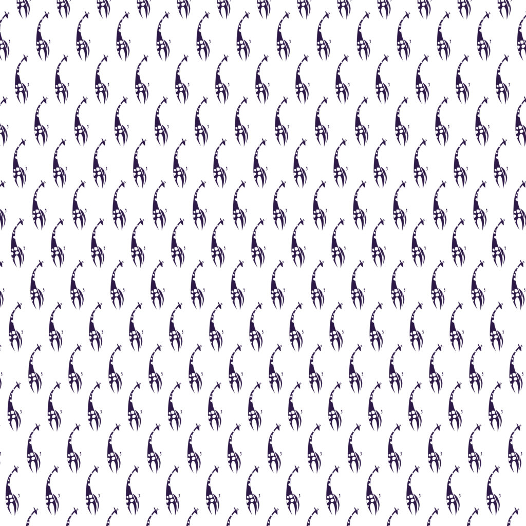
An example of an often-used form of translational asymmetry to convey balance and confidence.
Alignment: Finding Order in Chaos
Alignment is a fundamental design principle that involves positioning various elements within a composition in relation to one another. It plays a crucial role in creating visual harmony and balance.
However, designers have the creative freedom to intentionally break alignment rules to draw attention and add visual interest. By strategically misaligning elements, they can inject a sense of excitement and unpredictability into their designs. This deliberate departure from conventional alignment rules captures viewers’ attention, making the design more memorable and engaging.

Mosaic balance is organised chaos, but creates balance due to there being no focal point.
While maintaining alignment is important for a cohesive layout, embracing intentional misalignment can help designers create unique and eye-catching designs that leave a lasting impression.
Contrast: Creating Visual Impact
Contrast adds excitement and visual interest to your designs. By combining elements that are different in colour, size, shape, or texture, you can create a dynamic interplay that captures attention and guides the viewer’s eye. Contrast is the magical ingredient that makes your design pop – total opposites that create a harmonious visual symphony.

An example of how using colour, scale, and proximity can create a focal point, even if the colour isn’t ‘louder’ than the other coloured elements.
Sufficient contrast is also a critical element in creating accessible designs that cater to individuals with visual impairments. By incorporating appropriate contrast levels between text and background elements, designers can enhance legibility and ensure that information is easily discernible. This consideration allows individuals with visual impairments to access and engage with the content, promoting inclusivity and usability.
Proximity: Grouping for Visual Unity
Proximity is the art of organising related elements together. By grouping elements that are related in content or function, you create visual unity and help viewers quickly make sense of the information presented.
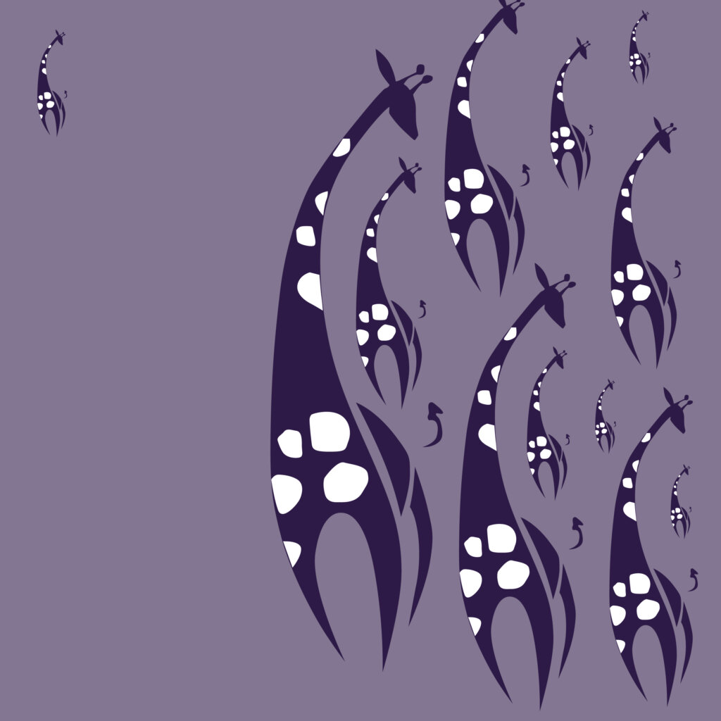
Combining proximity, scale and proportion, evokes a suggestion of a team or group and an outsider.
Organise groups of information together to increase readability and ease of scanning. Key information can be close or far apart in proximity to create focus points and draw attention and clarity to a design and the function of the information in it.
Repetition: Establishing Visual Consistency
Repetition strengthens the visual identity of your design. Repeating certain elements such as colours, shapes, or patterns creates unity and cohesiveness, making your design feel intentional and well-crafted.

An example of radial balance working alongside repetition.
White Space: Embracing the Power of Simplicity
White space, also known as negative space, is the breathing room within your design. It allows elements to stand out and creates a sense of balance and elegance. Embracing white space is essential for creating a clean and focused design.

Clear asymmetry, intentional imbalance and white space to create playfulness & focus.
It is like a peaceful oasis in the design desert. Let your elements breathe and enjoy the serenity of empty spaces. It’s like giving your design a luxurious vacation, away from the overcrowded jungle of cluttered designs.
Typography: The Art of Effective Communication
Typography plays a crucial role in design. Choosing the right fonts, sizes, and styles can convey different emotions and enhance the overall message of your design. Thoughtful typography ensures legibility and readability, making your content easily digestible.
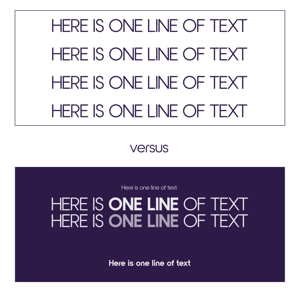
An example of hierarchy, contrast and proximity working together in typography.
Colour Theory: Evoking Emotion and Meaning
Colours have the power to evoke emotions and convey messages. Understanding colour theory enables you to choose palettes that align with your design’s desired mood and meaning. From warm and inviting to bold and energetic, colours speak directly to the viewer’s subconscious.

An example of using scale, proximity and colour to evoke a sense of being watched over or cared for.
Hierarchy: Guiding the Viewer’s Eye
Hierarchy is about organising information in a way that guides the viewer’s eye through the design. By establishing a clear visual hierarchy, you can emphasise important elements, prioritise information, and create a seamless flow of engagement.
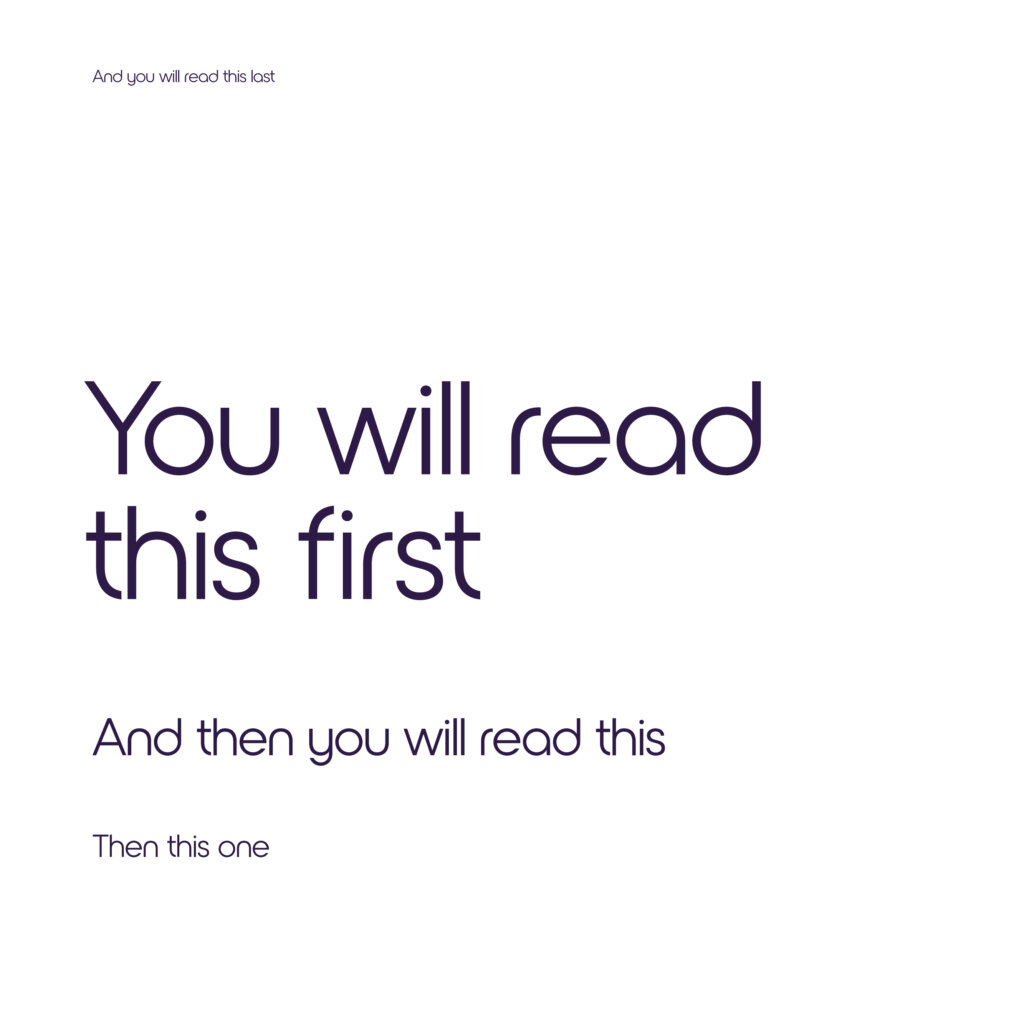
A well-known example of showing the order of viewing elements in effective hierarchy.
Scale and Proportion: Playing with Visual Weight
Scale and proportion refer to the relative size and ratio of elements within a design. By manipulating these elements, you can create a sense of hierarchy, depth, and emphasis, bringing visual interest and balance to your composition.

An example of how changing a scale proportionately to the original can change the depth of the overall composition.
Texture: Adding Depth and Dimension
Texture introduces tactile qualities to your designs, even in the digital realm. By incorporating textures, you can add depth and dimension, making your designs feel more realistic and engaging.

An example of how dropping in a background, some shadows and adding texture to the giraffe can start to lift a composition.
Unity: Creating a Cohesive Whole
Unity is the glue that holds all the design elements together. It ensures that every aspect of your design aligns with a consistent visual style and brand identity. Unity brings together the principles we’ve explored and transforms them into a cohesive and impactful design.

An example of glide reflectional symmetry working alongside misalignment to evoke unity and movement.
Summary
The 12 principles of design form the foundation of creating visually captivating and effective designs. They serve as the guiding light for creating captivating and visually appealing compositions. From balance and contrast to alignment and proximity, these principles form the backbone of every successful design. They dictate how elements interact, how information is organized, and how the overall visual impact is achieved.
By understanding and applying these principles, designers can unlock the true potential of their creations, capturing attention, conveying messages effectively, and leaving a lasting impression on their audience. This post offers a glimpse into the magical realm of the 12 principles of design, showcasing their importance and how they can be harnessed to create remarkable works of art.
If you would like support with your graphic design, please feel free to reach out to us at Purple Giraffe.


