Choosing the right image for your Facebook Advertising is not only essential to your campaigns success but incorrect images can lead to your ad being declined!
So, it is best to be aware of Facebook’s requirements.
The key thing to remember is less text is better. Too much copy is distracting and can cause Facebook to show your ad to fewer people. Ads with less than 20% text have been shown to perform best. In our experience, we’ve found large text, text boxes and logos are a no go. All text should appear to be a part of the main image rather than a separate element. Smaller areas of text like a small logo and a call to action (e.g. buy your tickets now!) or tagline are most successful as seen in the example below.

It’s all a bit of a guessing game but there is a quick fix! You can test your images through Facebook before setting up your ad campaign, right here.
Want to know how to take your images even further? Read on…
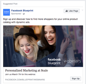
1. Use Images of people: This creates an instant emotional connection to your product or service. Consumers can begin to imagine how their challenges can be alleviated or needs can be satisfied by your organisation. This doesn’t necessarily have to be a happy image either it could be somebody frustrated or saddened by their current challenge. Positioning your product or service as the solution to their worries.
2. Use colour creatively: Try using colours in your images that represent your brand to create cohesive messaging. Alternatively, mix it up! Try bright colours or black and white. This will allow your ad to stand out against competitors. If you’re feeling extra creative you can even utilise the psychology behind colours to find those best suited to your message, find out more here.
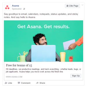
3. Include a clear value proposition: Make it clear why your audience should engage with your ad. In order to make an audience engage with something it must provide them with some value. This value can take many forms, including a free trial, free product or service, a time sensitive offer or perhaps a discount. Make this clear and simple in your ad imagery to not only attract attention from your audience but encourage action.
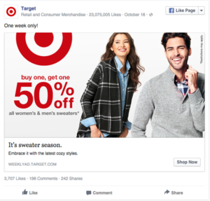
4. Try multiple images: Is the message you’re trying to communicate more complex or inclusive than just a single image? Create a collage of images that represent the key message of your brand. This is a perfect solution when you want to show the diverse services or products offered by your organisation.

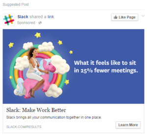
5. Try something ‘thumb stopping’: Sometimes using an image people expect isn’t the best way to capture their attention. We all know how fast we often scroll through our social media feeds. By using something unexpected and attention grabbing you have the chance to stop people in their tracks. As an example, would you associate a unicorn with a workplace messaging app? Just see what Slack has created below.
We hope this clears up some of the confusion around images for Facebook Advertising. We also hope these ideas have got your creative juices flowing!
P.S. You can jump straight in & start editing your images for Facebook Advertising success with these free tools.
Articles referenced in the writing of this blog
- https://www.facebook.com/business/ads/photo-ad-format
- https://www.facebook.com/business/help/980593475366490?ref=fbb_photoads#
