Aspen Holiday Parks
Case Study
Purple Giraffe believes establishing a strong and recognisable identity through cohesive branding and assets is essential for growing your brand presence.

Project Overview: Brand Consolidation
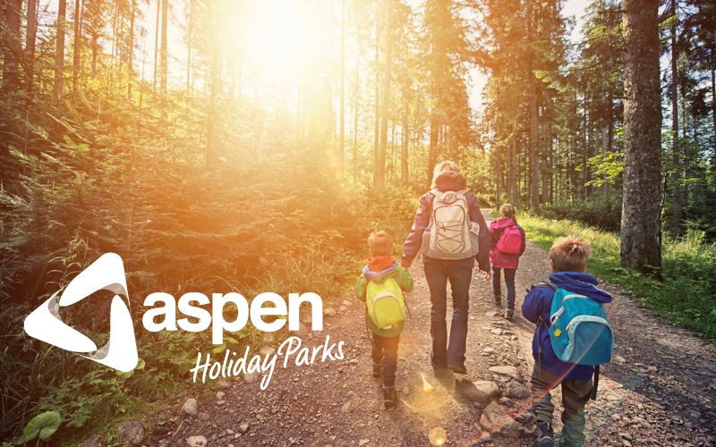
Aspen Holiday Parks approached Purple Giraffe to assist with the consolidation of their brand assets across all their Holiday Parks. Aspen Holiday Parks need to enhance their brand identity and presence in the market so that they were recognised across Australia as the leading budget friendly accommodation provider.
Objective
The challenge Aspen Holiday Parks faced was that all their holiday parks have different logos and identities, ultimately diminishing the overall recognition and cohesiveness of the Aspen brand.
The project’s objective was for Purple Giraffe to develop cohesive branding and assets that could be uniformly implemented across all parks, establishing a strong and recognisable identity for Aspen Holiday Parks.
The project required Purple Giraffe to update all six Holiday Park’s style guides, to include the updated consistent branding elements.
Brand Review and Consolidation
- Purple Giraffe reviewed existing branding and worked with the Aspen Group to understand the direction the organisation wished to move in and their critical success factors
- The brand graphic representing Aspen Group was created and the "Aspen Curve" was launched. The concept was created drawing inspiration from an element of the Aspen Holiday Park logo
- This cleaver design element offered an opportunity for the Aspen Group to incorporate a recognisable secondary language in their branding across all marketing collateral.
- Aspen Group and all six Holiday Parks received a "Brand Identity Style Guide" refresh, which outlines all logos, colour palettes, branding elements (curve and icons), and signage for internal and external guidelines.
- Each holiday park was provided with a distinct branding element that represents its park identity to use on artwork, flyers and social media. All individual park elements are in line with the new Aspen Holiday Parks brand style.
Project Outcomes
The brand has successfully attained and implemented consistency throughout multiple marketing assets, enhancing brand recognition and ultimately brand strength. We have even noticed some competitors drawing inspiration from the new assets (the ultimate compliment). The refined branding of Aspen Holiday Parks has instilled a fresh sense of organisational pride and given the organisation the much-needed lift it required to reach its positioning requirements as the leading budget friendly accommodation across Australia.
The final development of branding elements and style guides has resulted in Aspen Holiday Parks continuing to use Purple Giraffe for artwork creation and social media management. Based on the success of the initial branding project, the decision was made to continue the branding refresh journey with Purple Giraffe. The next phase included refreshing the Holiday Parks logos, developing external signage, email banner artwork, EDMs, flyers and in-room collateral.
Following on from the brand consolidation project, Purple Giraffe has been working on the artwork for their exhibition booth at the Illawarra Caravan and Camping Show. This artwork project includes a large booth backdrop, competition board, flyers and cut out dog. The client and the Purple Giraffe team are thrilled with how this is coming together.
Hear what Aspen Holiday Park’s Nicole Hyde has to say about working with Purple Giraffe here.
Want to see more?


